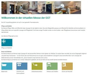
.w-blog-post-preview  {
	border-radius: 0 !important;
}


/* Navigation: Beitragskategorien */
.navBeitragsKategorie {
	
}

.menu-beitragskategorien-container {
		margin-bottom: 40px;
}

#menu-beitragskategorien > li {	
	line-height: 15px;
	background-color: #444f4f;
	color: #ffffff;
	width: 180px;	
}
/* Navigation: Beitragskategorien */

.telnummer {
	/*color: red;*/
}

/* BLOG-Content */

.l-titlebar-content {
	display: none;
}

.g-breadcrumbs {
	text-align: left;
}

.wp-post-image {
	border: 0px solid red;
	height: auto; 
  width: auto; 
  max-width: 300px; 
  max-height: 190px;
}


.h2_ggt {
	font-size: 24px;
	color: #444f4f;
}

.menu-item-5902 > .level_1 > .w-nav-arrow {
	visibility: hidden;
}

.menu-item-6460 > .level_3 > .w-nav-arrow {
	visibility: hidden;
}

#menu-item-11396 {
	display: none;
	visibility: hidden;
}

.menu-item-5956 > .level_2 > .w-nav-arrow {
	visibility: hidden;
}

.menu-item-10940> .level_2 > .w-nav-arrow {
	visibility: hidden;
}

.hide-menu {
	display: none;
	visibility: hidden;
	margin-left: -5000px;
}


/* Subheader-Bottom*/
.l-header > .l-subheader .l-subheader-h  {
		/* z-index: -20; */
		/* margin-top: -25px; */
}

/* Menü gleich große graue Kacheln und die Schrift mittig gesetzt*/
.header_hor .ush_menu_1.type_desktop .w-nav-list.level_1 > .menu-item > a {
    padding: 0 20px;
    width: 214px;
    text-align: center;
}

/* ITEM-7257 = ÜBER UNS */
	.menu-item-7257 > .w-nav-list > .level_2  {
		/* positiv = nach links */
		/* negativ = nach rechts */
		margin-right: -8px;
	}


/* Verbraucher 
weiter links (zentriert)*/
	.menu-item-7251 > .level_1 > .w-nav-title {
		margin-left: 0px;
}

/* START Menü-Level 2*/
.menu-item-5902 > .w-nav-list > .level_2 {
	display: none;
	visibility: hidden;
	margin-left: -5000px;
}

/* Verbraucher > IDdN > Menü-Level 3*/
.menu-item-7251 > .w-nav-list > .level_3 {
	display: none;
	visibility: hidden;
	margin-left: -5000px;
}

#bannerPic, .bannerPic {
		border: 0px solid red;
}

#main-icon-row, #mainIconRow {
	border: 0px solid red;
}


/* Slider Schrift dünner */
.sliderous {
	font-weight: 100;
	letter-spacing: 0.01em;
	color: #e2e2e2;
	font-size: 35px; 
}

/* Text unter den Icons auf Start und Verbraucher-Seite */
.iconText {
	margin-top: -10px;
	font-size: 20px;
	color: #444f4f;
}


/* Zeile mit Breadcrumb */
.breadcrumbRow {
	/*padding-bottom: 25px; */	
}

.breadcrumpRowContent {
	padding-top: 15px;
	padding-left: 250px;
	padding-bottom: 15px;
}
/* Zeile mit Breadcrumb */

#main-icon-row, #mainIconRow, .mainIconRow {
	margin-top: 40px;
	border: 0px solid red;
}


/* mainContentRow neu setzen */
#mainContentRow, #mainContentRowStart,
.mainContentRow, .mainContentRow {
	margin-top: 0px;
	border: 0px solid red;
}


#leftMainCol, .leftMainCol {
	margin-top: 30px;
	border: 0px solid red;
}

#rightMainCol, .rightMainCol {
	margin-top: 00px;
	border: 0px solid red;
}


/* Aufzählungszeichen quadratisch */
.square {
	list-style-image: url('/wp-content/uploads/2017/06/lsi-1c937e.png');
}

/* PU-Kachel */
.img-1 {
				height: 20%; width: 20%;
				float: left;
				border: 0px solid green;
				padding: 10px;
				margin: 1%;
				background-color: #ffffff;
			}
.imgPU {
				width: 80%;
				text-align: center;
				border: 0px solid orange;
			}

#shortProfilRow {
	margin: 2%;
}

.shortProfilLogo {	
	text-align: center;
	border: 0px solid red;
}

/* START: MEDIA-QUERIES MOBIL-GERAETE */
/* iPhone und son Gedöns */
@media screen and (max-width: 667px) {
	.header_hor .ush_menu_1.type_desktop .w-nav-list.level_2 > .menu-item-7251 > ul {
		margin-left: 0px;
	}

.menu-item-7251 > .level_2 {
		margin-left: 0px;
	}

	/* Slider Schrift dünner */
	.sliderous {
		font-weight: 100;
		letter-spacing: 0.01em;
		color: #e2e2e2;
		font-size: 25px; 
	}

	/* Zeile mit Breadcrumb */
	.breadcrumbRow {
		/*
		margin-left: 30px;
		margin-top: 20px;
		padding-bottom: 25px;
		*/	
	}
	
	.breadcrumpRowContent {
		padding-top: 15px;
		padding-left: 10px;
		padding-bottom: 15px;
	}
	/* Zeile mit Breadcrumb */


	/* PARTNERKACHEL-BREITE */
	.img-1, .img-2, .img-3, .img-4 , .img-5, .img-6, .img-7, .img-8{
					height: 33%; width: 33%;
					float: left;
					border: 0px solid yellow;
					padding: 5px;
					margin: 1%;
					background-color: #ffffff;
				}

	.pu-row {
		text-align: center;
	}

	.partnerkachel {
		text-align: center;
		width: 1500px;
		font-size: 0.8em;
		
	}
	
	.partnerkachel-outer {
		text-align: center;
		width: 200px;
		border: 0px solid red;
		
	}

	.partnerkachel-inner {
		text-align: center;
		width: 150px;
		border: 0px solid green;
		
	}

	img.ggtmobile {
		text-align: center;
		width: 100px;	
		border: 0px solid red;
	
	}
	/* PARTNERKACHEL-BREITE */
	
	/* touch-Funktion */
	.praeskomm:touch {
		/*color: red;*/
	}

}/* ENDE: 667px */

@media screen 
	and (max-width: 667px) 
	and ( orientation: landscape ) {
	
	/* Zeile mit Breadcrumb */
	.breadcrumbRow {
		/*
		margin-left: 45px;
		margin-top: 20px;
		padding-bottom: 25px;
		*/	
	}
	
	.breadcrumpRowContent {
		padding-top: 15px;
		padding-left: 20px;
		padding-bottom: 15px;
	}
	/* Zeile mit Breadcrumb */

	/* PARTNERKACHEL-BREITE */
	.img-1 {
					height: 25%; width: 25%;
					float: left;
					border: 0px solid green;
					padding: 10px;
					margin: 1%;
					background-color: #ffffff;
				}

}


@media screen and (max-width: 667px) 
						  and ( orientation: portrait) {
				/* PARTNERKACHEL-BREITE */
				.img-1 {
					height: 40%; width: 40%;
					float: left;
					border: 0px solid white;
					padding: 5px;
					margin: 1%;
				}
} /* ENDE: 667px AND portrait*/


/* iPad: portrait and landscape */
@media screen and (min-device-width : 768px) 
and (max-device-width : 1024px)  {
	.header_hor .ush_menu_1.type_desktop .w-nav-list.level_1 > .menu-item > a {
		padding: 0 20px;
		width: 120px;
		text-align: center;
		font-size: 14px;
	}

/* Verbraucher 
weiter links (zentriert)*/
	.menu-item-7251 > .level_1 > .w-nav-title {
		margin-left: -10px;
}


.header_hor .ush_menu_1.type_desktop .w-nav-list.level_2 > .menu-item > a {
		font-size: 15px;
	}

	.header_hor .ush_menu_1.type_desktop .w-nav-list.level_2 li > ul > .level_3 > .menu_item > a {
		font-size: 15px;
	}

.header_hor .ush_menu_1.type_desktop .w-nav-list.level_2 > .menu-item .level_3 > .menu-item > a {
		font-size: 15px;
	}
		
	/* ITEM-7257 = ÜBER UNS */
	.menu-item-7257 > .level_2 {
		/* positiv = nach links */
		/* negativ = nach rechts */
		margin-right: -82px;
	}

	/* ITEM-7251 = VERBRAUCHER */
	.menu-item-7251 > .level_2 {
		/* positiv = nach rechts */
		/* negativ = nach links */
		margin-left: -72px;
	}

	/* ITEM-7362 = LEISTUNGEN */
	.menu-item-7362 > .level_2 {
		/* positiv = nach rechts */
		/* negativ = nach links */
		margin-left: -157px;
	}

	/* Text unter den Icons auf Start
			und Verbraucher-Seite */
	.iconText {
		font-size: 16px;
		font-weight: bold;
	}

	/* Zeile mit Breadcrumb */
	.breadcrumbRow {
		/*
		margin-left: 45px;
		margin-top: 20px;
		padding-bottom: 25px;
		*/	
	}
	
	.breadcrumpRowContent {
		padding-top: 15px;
		padding-left: 0px;
		padding-bottom: 15px;
	}
	/* Zeile mit Breadcrumb */
}/* iPad: portrait and landscape */

/* iPad: portrait */
@media screen 
	and (min-device-width : 768px) 
	and (max-device-width : 1024px) 
	and (orientation : portrait) { 
	
	/* Verbraucher 
wieder weiter nach rechts */
	.menu-item-7251 > .level_1 > .w-nav-title {
		margin-left: 0px;
}
	
	/* ITEM-7362 = LEISTUNGEN */
	.menu-item-7362 > .level_2 {
		/* positiv = nach rechts */
		/* negativ = nach links */
		margin-left: 0px;
	}
	
	/* ITEM-7251 = VERBRAUCHER */
	.menu-item-7251 > .level_2 {
		/* positiv = nach rechts */
		/* negativ = nach links */
		margin-left: 0px;
	}

	.katalog-bild > .w-image-h > a > img {
		width: 400px;
}

/* PARTNERKACHEL-BREITE */
	.partnerkachel {
		/*	
		width: 80px;
		font-size: 0.8em;
		*/
	}
	
	.partnerkachel-outer {
		/*
		width: 200px;
		border: 0px solid red;
		*/
	}

	.partnerkachel-inner {
		/*
		width: 150px;
		border: 0px solid green;
		*/
	}

	img.ggtmobile {
	/*	
		width: 80px;	
		border: 0px solid red;
	*/
	}
	/* PARTNERKACHEL-BREITE */

}/* iPad: portrait */


/* iPad: landscape */
@media screen 
	and (min-device-width : 768px) 
	and (max-device-width : 1024px) 
	and (orientation : landscape) { 
	
	/* Zeile mit Breadcrumb */
	.breadcrumbRow {
		/*
		margin-left: 45px;
		margin-top: 20px;
		padding-bottom: 25px;
		*/	
	}
	
	.breadcrumpRowContent {
		padding-top: 15px;
		margin-left: -10px;
		padding-bottom: 15px;
	}
	/* Zeile mit Breadcrumb */
	
}/* iPad: landscape */


/* Display größer als 1024px */
@media screen and (min-device-width : 1025px) {	

	/* ITEM-7257 = ÜBER UNS */
	.menu-item-7257 > .level_2 {
		/* positiv = nach links */
		/* neagtiv = nach rechts */
		margin-right: 0px;
	}

	/* ITEM-7251 = VERBRAUCHER */
	.menu-item-7251 > .level_2 {
		/* positiv = nach rechts */
		/* neagtiv = nach links */
		margin-left: 0px;
	}


}/* iPad: portrait and landscape */
/* ENDE: NAVIGATIONS-CSS */
/* ENDE: MEDIA-QUERIES MOBIL-GERAETE */


/* GGT-Grün definieren */
.ggtgreen {
	color: #1c937e;	
}

.iconTextColor {
		color: #444f4f;
}

.hvr-float-shadow {
display: inline-block;
vertical-align: middle;
-webkit-transform: perspective(1px) translateZ(0);
transform: perspective(1px) translateZ(0);
box-shadow: 0 0 1px transparent;
position: relative;
-webkit-transition-duration: 0.3s;
transition-duration: 0.3s;
-webkit-transition-property: transform;
transition-property: transform;
}


.hvr-fade {
  display: inline-block;
  vertical-align: middle;
margin: 0 auto;
  -webkit-transform: perspective(1px) translateZ(0);
  transform: perspective(1px) translateZ(0);
  box-shadow: 0 0 1px transparent;
  position: relative;
margin-left: 80px;
  -webkit-transition-property: color;
  transition-property: color;
  -webkit-transition-duration: 0.3s;
  transition-duration: 0.3s;
background-image: url("/wp-content/uploads/2013/05/Präsentation_Kommu-e1501163783531.jpg");
}
.hvr-fade:before {
  content: "";
  position: absolute;

  z-index: -1;
  top: 0;
  left: 0;
  right: 0;
  bottom: 0;
	
    background-image: url("/wp-content/uploads/2016/12/Markt_Trend-2-e1501164270101.jpg");
  -webkit-transform: scaleY(0);
  transform: scaleY(0);
  -webkit-transform-origin: 50% 0;
  transform-origin: 50% 0;
  -webkit-transition-property: transform;
  transition-property: transform;
  -webkit-transition-duration: 0.3s;
  transition-duration: 0.3s;
  -webkit-transition-timing-function: ease-out;
  transition-timing-function: ease-out;

}
.hvr-fade:hover, .hvr-fade:focus, .hvr-fade:active {
  color: white;

}
.hvr-fade:hover:before, .hvr-fade:focus:before, .hvr-fade:active:before {
  -webkit-transform: scaleY(1);
  transform: scaleY(1);
}


.konstantin {
    display: inline-block;
    vertical-align: middle;
    transform: translateZ(0);
    box-shadow: 0 0 1px rgba(0, 0, 0, 0);
    backface-visibility: hidden;
    -moz-osx-font-smoothing: grayscale;
    transition-duration: 0.3s;
    transition-property: transform;
background-image: url("/wp-content/uploads/2013/05/Markt_Trend-1.jpg");
}

.konstantin:hover,
.konstantin:focus,
.konstantin:active {
    transform: scale(1.05);
box-shadow: 0 0 20px rgba(0, 0, 0, 0.6);
}


.ggt {
    display: inline-block;
    vertical-align: middle;
    transform: translateZ(0);
    box-shadow: 0 0 1px rgba(0, 0, 0, 0);
    backface-visibility: hidden;
    -moz-osx-font-smoothing: grayscale;
    transition-duration: 0.3s;
    transition-property: transform;
}

.ggt:hover,
.ggt:focus,
.ggt:active {
    transform: scale(1.05);
box-shadow: 0 0 20px rgba(0, 0, 0, 0.6);
}
 

.konstantin:hover,
.konstantin:focus,
.konstantin:active {
    transform: scale(1.05);
box-shadow: 0 0 20px rgba(0, 0, 0, 0.6);
}


/* Button mehr erfahren Umrandung */
.style_outlined {
	width: 149px;
	height: 40px;
	position: relative;
display: -webkit-flex;
}


/* Button mehr Erfahren Schriftänderung */

.w-blog-post-more > .w-btn-label {
  	visibility: hidden;
	display: -webkit-flex;
}

.w-blog-post-more > .w-btn-label:after {
	margin-left: -117px;
	font-size: 15px;
	content: 'mehr Erfahren';
 	visibility: visible;
}


/* MainContent, rechts Spalte */
.unterberg {
/* padding-top: 50px; */
margin-left: 0px !important;
}

.aragorn {
	/* padding-top: 50px; */
	margin-left: 0px !important;
	margin-right: 50px;
}

header.sticky .w-img.with_transparent img.for_transparent {
 display:block;
 height: 82%;
 margin-top: 9px;
}

header.sticky img.for_default {
 display:none;
}

/* Button auf der Startseite Rechter Teil Aktuelles */
.my-more-link {	
	padding: 5px; 
	color: #fff;
	border-radius: 8px;
border: 2px solid #dae0e0; 
	display: inline;

font-size: 15px;
	content: 'Mehr erfahren';
 	visibility: visible;

width: 149px;
	height: 40px;
	position: relative;
display: -webkit-flex; 
}

/* Button-Beschriftungen Startseite*/
.optimum:after {
	content: 'Mehr erfahren';
 	visibility: visible;
}

.kuq:after {
	content: 'Mehr erfahren';
 	visibility: visible;
}

.akademie:after {
	content: 'Mehr erfahren';
 	visibility: visible;
}

/* Button in Präsentation & Kummunikation */
.btnPreComm {
	width: 250px;
	content: '';
 	visibility: visible;
	text-align: center;
}

.dauerausstellung:after {
content:'';
visibility: visible;
}


.musterhaeuser:after {
content:'';
visibility: visible;
}

.messen:after {
content:'';
visibility: visible;
}

.handbuch:after {
content:'';
visibility: visible;
}


/* Auf der Verbraucherseite Abstand Anpassung zwischen den Icons */

/*.w-iconbox.iconpos_top {
    text-align: center;
    margin: -30px;
    max-width: 25rem;
    position: absolute;
}*/


/* Hauptmenü Graue Flächen eingebunden*/
.menu-item-5902, .menu-item-7257, .menu-item-5962, .menu-item-5969, .menu-item-7251, .menu-item-7362 {
		background-color: #e2e2e2;
		/* margin-left: 0px; */
}


/* Rechte Spalte */
.rightcolCenter {
	text-align: left;
}

/* Rechte Spalte mit Icons */
.div_icon_right_col {
	text-align: center; 
	border: 0px solid blue; 
	width: 60px;
}

.btnLinkGGTSeminare {
	content:'';
	visibility: visible;
}

.btnLinkGGTSeminare:hover {
	content:'';
}


/* START: Überschriftengröße */
.h1, .w-blog-post-title {
	font-size: 36px;
}

.h3 {
	font-size: 20px;
}

.h4 {
	font-size: 15px;
}
/* ENDE: Überschriftengröße */


.ggtheadline {
 color: #1c937e;
	/* font-size: 36px; */
}

.w-blog > .w-blog-post-body > .entry-title { color: #1c937e; }


/* Button Kontaktformular */
.kontaktform > button > .w-btn > .w-btn-label {
  	visibility: hidden;
	display: -webkit-flex;
}

/* Bildabstände rechte Spalte */
#RightColImg {
	margin-bottom: 20px;
}

/* Rechte Spalte */
#rightcolCenter{
	/* Border setzen */
	border-top: 0px solid red;
}

/* Überschrift Startseite Blog-Header */
div.w-blog-post-h div.w-blog-post-body h2.w-blog-post-title a.entry-title {
	color: #5c6566;
	font-size: 16px;
	font-weight: bold;
	font-stretch: ultra-expanded;
}

/* Cursor für Icons bei iOS */
.w-iconbox, .w-iconbox:hover, .w-iconbox:active {
/* Chrome 1-21, Safari 4+ */	
cursor: -webkit-grab;

/* Firefox 1.5-26 */
cursor:    -moz-grab; 

/* W3C standards syntax, should come least */
cursor:         grab; 
}


.w-iconbox-link, .w-iconbox-link:hover, .w-iconbox-link:active {
	/* Chrome 1-21, Safari 4+ */	
cursor: -webkit-grab;

/* Firefox 1.5-26 */
cursor:    -moz-grab; 

/* W3C standards syntax, should come least */
cursor:         grab;
}


/* Kategorien bei Blogs ausblenden */
.l-sidebar > #categories-2 {
	visibility: hidden;
}

.partnerListe {
	margin-right: -30px;
}


.rightColInnerRow {
	border: 0px solid green;
}

#boxHellGrau {
	text-align: center; 
	padding: 20px; 
	background-color: #e2e2e2; 
	color: #444f4f; 
	font-size: 20px;
}

#boxDunkelGrau {
	text-align: center; 
	padding: 2px; 
	padding-bottom: 20px; 
	background-color: #444f4f; 
	color: #e2e2e2; 
	font-size: 20px; 
	letter-spacing: 0.05em;
}

